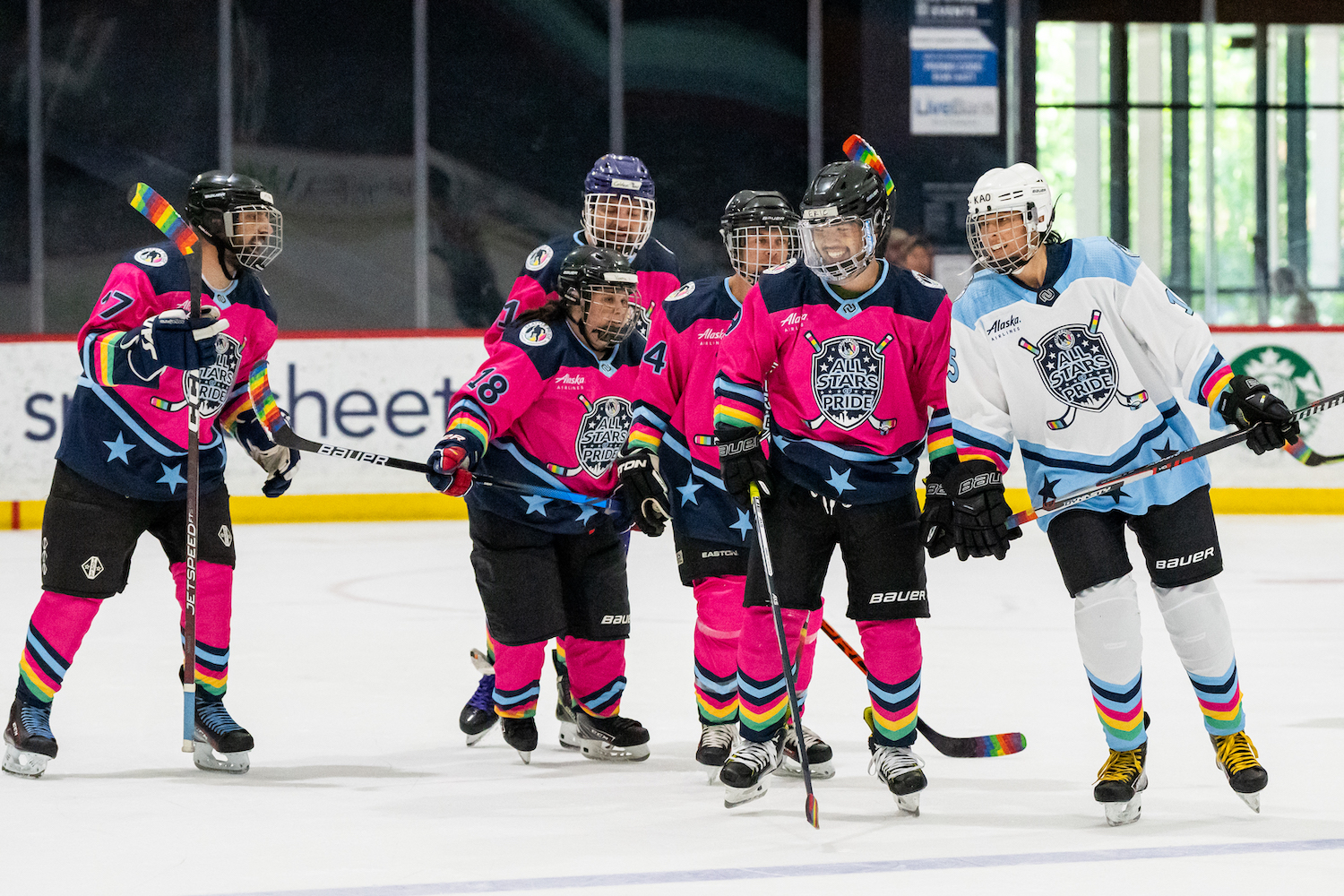
BRAND & COLORS

Seattle Pride Hockey Association is on a mission to make hockey more inclusive. We do this through a variety of ways, but our visual brand identity and messaging is one important way.

OUR LOGOS

Circular option – used on social media, particularly with lighter backgrounds.

Circular option – used on social media, particularly with darker backgrounds.

Header option – used on documents, websites, particularly on media with light/white backgrounds.

Header option – used on documents, websites, particularly on media with black/dark backgrounds.

OUR COLORS

#E5476F

GOAL LIGHT RED – Loud and proud: capturing the excitement and electricity of the game.

#FFD166

PRIDE YELLOW – Radiant and energized: bursting with energy, shining through for all to see.

#06D6A0

SEATTLE GREEN – Bold and bountiful: repping the Emerald City and its evergreen spirit.

#ADE8F4

ICY BLUE – Sleek and elegant: frigid at first, ready to bolt like a breakaway.


#023047

POWER BLUE [THE BACKGROUND COLOR OF OUR WEBSITE] – Swift and strong: a deep hue connected to the region’s abundant waters.

#FFFFFF

SNOWCAP WHITE – Crisp and bright: towering over the city on its peaks.


CONTACT US

Would you like to utilize our logo or assets in a press release or other media? Please contact us at [email protected] with your organization information, usage intent, and we’ll be in touch.

MANAGE ALL YOUR HOCKEY IN ONE PLACE

Go directly to mySPHA: my.seattlepridehockey.org